 31 Mar 2012, 09:31
|
#1 |
|
Mega Loafer
 Join Date: 27.07.2003
Location:
Posts: 3,296
|
I've read there are two covers. I have a black and white photo of Meat's straight face. Doesn't reveal a lot. Nothing special :)
|

|

|
|
31 Mar 2012, 09:45
|
#2 |
|
Promoted to Wario's spellchecker
Join Date: 17.09.2005
Location:
Posts: 12,947
|
Different album cover in USA I think
|
|
|
|
|
31 Mar 2012, 09:59
|
#3 |
|
Mega Loafer
Join Date: 08.05.2008
Posts: 3,562
|
Wasn't it Blind Before I Stop that had a different cover in the U.S.? Reminds of a post I read on some music forum regarding how you can judge the quality of Meat Loaf's albums by their cover art:
Fantasy art: great album Comic strip-like art: good album Photo of Meat Loaf: Avoid Worst Meat Loaf album cover so far. Technically the photo is not bad and quite impressive but it's not a good choice for an album cover, in my opinion. |
|
|
|
|
31 Mar 2012, 10:01
|
#4 |
|
Monstro helps me spell things...
Join Date: 05.01.2007
Location:
Posts: 9,105
|
MATLAF:
Worldwide cover: 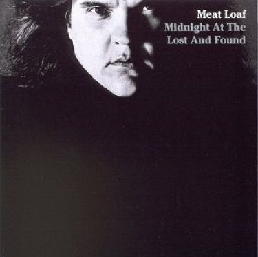 Australian cover:   as for BBIS.... UK Cover:  US Cover: 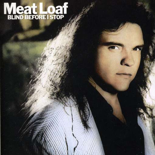
|
|
|
|
|
31 Mar 2012, 10:57
|
#5 |
|
"Most things that i worry about, never happen anyway"
Join Date: 29.11.2003
Location:
Posts: 5,358
|
The black MATLAF definitely has more impact than the Australian version
|
|
|
|
|
31 Mar 2012, 11:06
|
#6 |
|
Mega Loafer
Join Date: 09.02.2010
Location:
Posts: 1,934
|
I'm not a fan of any of these album covers.
I know that there are quite a few albums around that feature a photograph of the artist and I'm not saying that he hasn't got the face for album covers but I feel that the fantasy art style covers are much more interesting. The fantasy art seems to suit Meat Loaf albums. |
|
|
|
|
31 Mar 2012, 20:18
|
#7 |
|
Armed ba$tard and Jo's other half.
Join Date: 06.08.2002
Location:
Posts: 16,104
|
It's not an offensive cover, but it's much less than we are used to. The fact that Meat sees to be wearing a black sweater, and leaving the bottom two thirds of the cover completly black is interesting. There just not much to get excited about. However, I do prefere it to the Australian cover. Perhaps because i'm used to it, but I think the Auzie cover looks more like the cover of a chop & shop compilation. |
|
|
|
|
31 Mar 2012, 21:19
|
#8 |
|
Mega Loafer
Join Date: 16.04.2003
Location: Sheffield UK
Posts: 5,910
|
I liked the B&W Midnight cover. Didn't like the BBIS UK cover .. the cut and paste concept didn't work for me and it simply doesn't look much like Meat. LOVED the US cover though. For me a nice change from the fantasy artwork. I like Meat's picture on album covers ..
and skulls = Amazing album |
|
|
|
|
02 Apr 2012, 00:19
|
#9 | |
|
Super Loafer
 Join Date: 03.06.2011
Posts: 667
|
Quote:
|
|
|
|
|
|
02 Apr 2012, 07:53
|
#10 | |
|
Promoted to Wario's spellchecker
Join Date: 17.09.2005
Location:
Posts: 12,947
|
Quote:
|
|
|
|
|
|
02 Apr 2012, 12:32
|
#11 | |
|
Mega Loafer
Join Date: 08.05.2008
Posts: 3,562
|
Quote:
|
|
|
|
|
|
28 Apr 2012, 18:57
|
#12 |
|
Mega Loafer
Join Date: 16.02.2003
Location:
Posts: 2,217
|
I like that it's black. For me it sort of matches what Meat was going through at the time.
|
|
|
|


